Learn about the benefits of constructing a multi-year internship from a MLIS student's perspective.

User Experience and Translatability: Compatible or in Conflict?
UX (User eXperience) is not an easy concept to pin down, but there is general agreement that it focuses on the total subjective experience of the user – such as whether using a product or service produces a positive, negative, or middle-of-the-road reaction – and on whether the product or service meets the user’s needs.
There are many different ways a user can interact with library services and products, and one of these is through a library’s website. Libraries seek to serve a broad range of users, including groups that are linguistically diverse. Some libraries, such as the Ottawa Public Library, are interested in making sections of their website available in a range of languages (see Machine Translation: Can it Help Newcomers Access the Public Library?). However, translation can be expensive.
Controlling Language to Control Costs?
One strategy to reduce translation costs is to plan for translation when creating a website’s textual content. So-called “controlled authoring” involves reducing linguistic ambiguities and simplifying structures in the source text so that it can be translated more easily. Another cost-reduction strategy is to integrate automatic machine translation (MT) into the translation process. Indeed, these two cost-saving strategies can even be combined: a text that has been authored using a controlled language can often be processed more easily by an MT system and will typically result in higher quality MT output.
Nevertheless, some important questions remain. For instance, how does a text that has been written in a controlled fashion affect the UX of source-language readers? Does using a controlled language improve the translatability of that text when the translation is done using an MT system? And what is the UX for target-language readers of this machine-translated version? To investigate these questions, we conducted a pilot study to explore the relationship between UX and translatability with regard to a website’s textual content.
Two Types of Style Guides
First, we identified style guides that are intended to help web content developers produce a positive UX for readers. Next, we consulted several sets of controlled language guidelines that are intended to help writers produce a text that can be effectively translated, particularly with the help of an MT system. As shown in the table, there were some similarities between the two sets, but there were also guidelines that were in direct opposition. An overarching tension is between being engaging (UX-oriented guidelines) and being precise (translatability-oriented).
| UX-Oriented Guidelines | Translatability-Oriented Guidelines | |
|---|---|---|
| Similar | Use the active voice Use short paragraphs (max 5 sentences, ideally 2 or 3) Use short sentences, maximum 20 words | Use the active voice Use short sentences, maximum 25 words |
| In Opposition | Be as simple and concise as possible Use headings and lists May start a sentence with "but", "and", or "or" if it clarifies the sentence Use familiar, commonly used words; avoid jargon | Use optional pronouns (that and who) and punctuation (commas) Avoid very short sentences, headings, and sentence fragments Use standard English grammar, punctuation, and capitalization Use precise and accurate terminology |
Putting Them to the Test
A section of the University of Ottawa’s website was “rewritten” to produce two different English-language versions: version 1 was written according to UX-oriented guidelines, while version 2 was written according to translatability-oriented guidelines.
One hundred and seven native English speakers were asked to read both versions and to indicate which version they preferred, and why:
- 61% of English readers preferred the UX-oriented version. They noted that they liked the use of headings and bullet points, and that they found it more concise, more engaging and easier to scan.
- 39% of English readers preferred the translatability-oriented version, observing that they found it to be clearer and more consistent.
Both versions were then translated into Spanish using the Google Translate MT system. Three professional translators were asked which version produced a “better” translation. While both versions contained problems, all three translators agreed that the version that had been written according to translatability-oriented guidelines resulted in a more accurate and fluid text.
To investigate the UX of target language readers, we also surveyed 178 native Spanish speakers, asking them to read both Spanish-language translations and to indicate which version they preferred and why. This time, we saw almost a complete reversal of the results that were generated by the English-language respondents:
- 62% of Spanish readers preferred the translation that had resulted from the text produced according to the translatability-oriented guidelines. They claimed this text was easier to understand, sounded more natural, contained fewer grammatical errors and contained better word choices.
- 38% of Spanish readers preferred the translation that had resulted from the text produced according to the UX-oriented guidelines, citing reasons such as better organization and a friendlier tone.
Having it All?
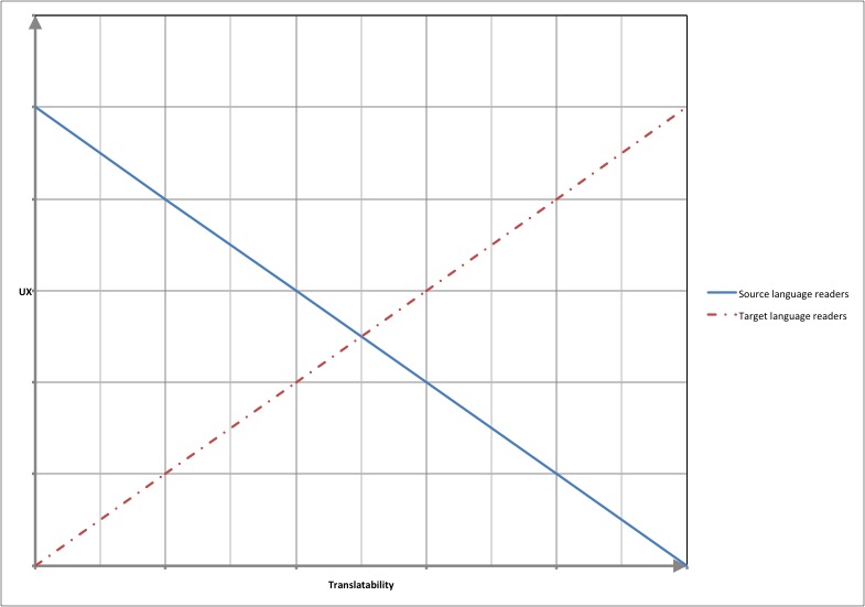
Overall, the results of this pilot study suggest that:
- as translatability increases, the UX of source-language readers begins to decrease, but
- as translatability increases, the UX of target-language readers begins to increase.

The key, then, is to find the point where both groups are reasonably content. The fact that the results in both cases produced roughly a 40/60 split – rather than a much more polarized result – gives hope that it could be possible to strike an acceptable balance.
Indeed, 5% of English respondents and 6% of Spanish respondents suggested that they would ideally have liked to see elements from both versions combined (e.g. the organizational structure of the UX-oriented text and the clarity of the translatability-oriented text). Seeking this middle ground may be a reasonable path forward for a library or other organization who wants to maximize the UX of a website for a diverse linguistic population while still managing costs.
Lynne Bowker is Director and Professor at the University of Ottawa’s School of Information Studies. Jairo Buitrago Ciro is a student in uOttawa’s Master of Information Studies program.
This Post Has One Comment
Comments are closed.


Great article, Lynne and Jairo! Thanks for doing this work and sharing your results. Best, Michael