Learn about the benefits of constructing a multi-year internship from a MLIS student's perspective.

The Language of Space
The spaces in libraries speak; they speak much louder and more consistently than our policies, signs, or staff can, and they always speak in the very specific language of the context in which they find themselves.
Our values and expectations are embedded in our spaces, as are our examined and unexamined assumptions. Understanding how to use space to communicate lets us better express what that space is for, and is the key to helping patrons understand what it is they can do inside a library.
When you see computers in libraries, the vast majority of the time you’re looking at rows of workstations. Partly this is so because it’s efficient. Rows of outlets, rows of cables, wide aisles for accessibility purposes; it’s all very orderly. The computer lab is an early and easy model that works to provide clear access to digital tools and materials. Put computers in an neat and tidy bank, and patrons can scan the room for an empty seat. It made sense for a long time, particularly when libraries were one of the few places where patrons could use computers for free. Things have changed, but our room layouts, largely, have not.
Workstations dictate a particular kind of intellectual labour: individual, independent, typing-based, and quiet. With our furniture and technology, we have framed digital interaction as solitary, and have re-created that solitary experience almost everywhere computers go. One keyboard, one chair, one mouse. Carrels with barriers on three sides. A shallow table with enough room for a keyboard, a monitor, an open textbook, and a set of typing hands. These things reinforce the notion that digital materials are meant to be accessed in private, by a single person at a time.
In the “library without walls” we can access information from anywhere all by ourselves, and the solitary structure of private workstations reinforces and reifies that independence. It’s as if we’re saying that that’s what’s legitimate information gathering and interpretation needs to look like.
We no longer need to define computing this way. Doing so is holding us back.
With the rapidly declining price of computing, and the explosion of smart phones and tablets, technology has come to play a radically different role in the lives of our patrons. Our spaces need to reflect this new reality. Every time we add another row of workstations, we are saying three things:
this is not the place where you can work with a partner or a group, keep your head down and work quietly, and we’d prefer it if you’d use our computers, not your own.
This generally isn’t what anyone in libraries means to say, but that’s what the furniture says. It’s what the single mouse, the centered keyboard, the single chair, and the walled carrel say.

What can you do to make space speak to your openness to conversations, sharing and puzzling over materials with classmates, the use of personal devices, and to ongoing collaboration? How can you make spaces designed to be consultative and collaborative, making the latest tools available to patrons, and where staff can help and patrons in a comfortable and organic way? As we approach full digital saturation in our lives, we are finally as a point where we can stop stuffing rooms with monitors and keyboards in order to simply make digital material available.
We can make room for people again.
We can bring back roomy tables that let patrons spread out. In spaces where staff help is required, we can make the tables higher so that staff don’t have to crouch over to engage with patrons. With a good wifi signal, chairs on casters, and power for laptops and phones, you’ve created an information commons more flexible and more personalized than any we’ve created so far. The screens and keyboards, if required, come in with the patron now.
At the University of Toronto Mississauga (UTM) Library, we have twice as many devices on our wifi network than we have bodies in the building. Our patron’s laptops, tablets, and phones are all part of our ecosystem. We can encourage their good use by accepting them, making room for them, and making it plain that we do.
When we bring install computers in library spaces, we need to do so in ways that visually implies how we mean them to be used.
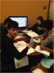
Adding a large monitor to one side of a table naturally breaks the workstation model and creates a unique collaborative space for groups. This is an experimental space at the UTM Library designed primarily for instructional technology staff to consult with faculty. We found that pushing the screen back and making it shared with wireless keyboards kept us from seizing control from our patrons seeking help, and instead turned the experience into a collaborative one with shared control. These spaces have been embraced by groups of studying students. Digital material is a natural part of the process, but doesn’t dominate. It merely adds to the toolset available. This layout uses the pieces of the workstation, but bends them out of shape. The important part of this study group is the students, not the screen.
Computers can take on pretty much any shape and size, depending on what we need them to do, and what kind of message we want them to project. Rather than think of computing as empty devices devoid of inherent meaning, we need to let the form we choose match our expectations of our patrons and our specific needs. If computers are meant to be public portals to things like a library catalogue, there are plenty of examples of devices that meet that need, but fit more seamlessly into a physical environment than keyboard-driven workstations do.

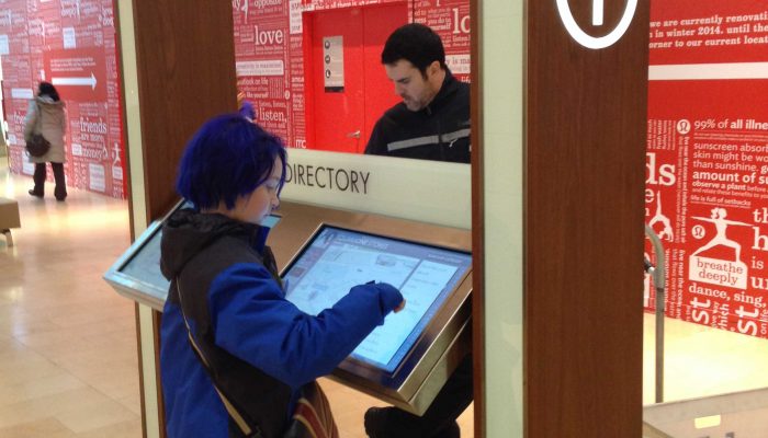
Touch screens are cropping up everywhere. Because they don’t have keyboards, they don’t automatically read as computers at all, and they don’t clearly belong to whoever is holding a mouse. Many libraries add keyboards to their new touchscreens on the off-chance that a patron might prefer it; there is kindness behind the impulse, but the presence of a keyboard breaks the language of the device is trying to speak and sends it right back into workstation territory.

A flashy alternative is beaming digital material onto surfaces using an interactive projector. This removes keyboards and monitors altogether, letting digital material literally become part of the furniture. Spaces like these are so far removed from a standard workstation that the embedded rules of computing no longer apply. Groups of people easily approach them, and interact with them as a group. And no one reaches for a mouse.
While computing devices become increasingly ubiquitous, it may seem counter-intuitive to suggest that we need fewer screens in libraries. But it’s not fewer screens at all. It’s actually far more. But they will be more varied, more personalized, more tailored to the tasks at hand, more sensitive to the variety of patron needs and to the modes in which digital material exists, and there will be a different one in every pocket. But we will cease owning and controlling all of them. Relying on patron-owned devices presents us with an opportunity to provide new computing spaces that aren’t found anywhere else, that are shaped to support new ways of integrating technology into learning and sharing, and help seamlessly foster collaborative activities.
A well-shaped space that meets the needs of patrons says what every library wants to say: we understand, and we’re here to help.
Rochelle Mazar is the Emerging Technologies librarian at the University of Toronto Mississauga, with an academic background in history and theological studies, and an interest in all things collaborative, digital, and disruptive. Contact her at rochelle [at] mazar.ca.


