The Hamilton Wentworth District School Board (HWDSB) Discovery Centre - formerly Kit Services - began…

The Innisfil Rebrand
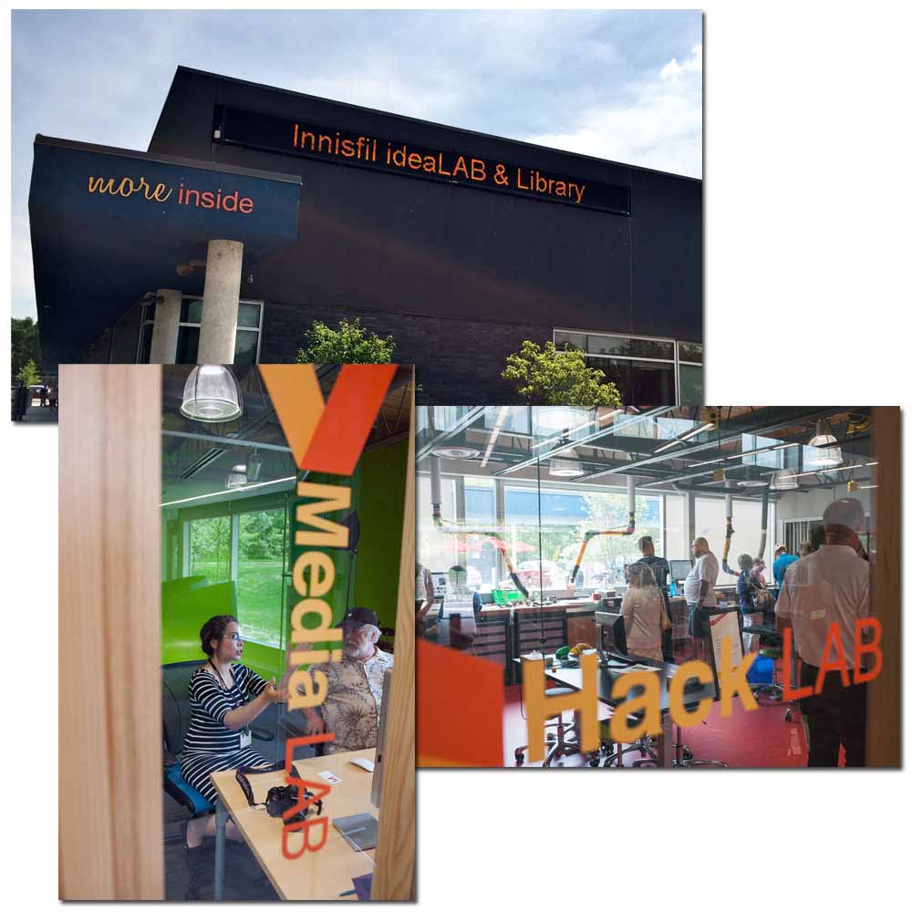
In May 2016, Innisfil Public Library revealed a significant rebrand, featuring a tweak on the name, a new logo and tagline, and an invitation to the community to think about the library differently. From a distance, it might seem like the newly renamed Innisfil ideaLAB & Library (iL&L) came out of nowhere, but in reality, this rebranding is the culmination of a long brand journey.
Innisfil Library had been thinking about their identity and direction going back to 2012, when the library adopted a new strategic plan, with a vision of “sparking ideas to ignite a dynamic, creative community”. For the Library, the challenge was taking that vision to the next level. Erin Scuccimarri, Manager of Marketing, Development & Community Engagement at Innisfil Library says of this process, “we knew what we wanted – but we didn’t know how to express it, or how far to push it”. To help them work through this, the library found expertise in local branding and marketing shop, Hardie and Company.
One of the first tasks was for the library to answer the question, “who are we”? This brainstorming activity determined the library’s “personality”, those traits the organization already has or wants to embody, which then influence their approach to decision-making and brand identity. The activity produced three personality traits: Quirky, Fearless, and Wildly Unexpected. By embodying these traits, the library made bold decisions, like naming their renovated downtown branch the ‘ideaLAB’ to reflect the different kinds of things users could do in the library. The brand, according to Erin Scuccimarri, is “…the glasses through which we view challenges and potential opportunities”.
By hiring Hardie and Company, iL&L benefited from hearing an external perspective. Jamie Hardie, Creative Strategist at Hardie and Company, describes the importance of a rebranding to the library’s survival: “any offerings [the libraries] have, all the programming and services [they] provide, no matter how unique and potentially valuable [they] think they are, won’t really matter if we can’t or don’t communicate [their] unique selling proposition effectively. It’s a harsh reality to grasp”.
Much of the success of the rebranding, says Jamie Hardie, can be attributed to the open-mindedness and desire for change expressed by the staff at iL&L. Hardie and Company believe that the staff at the Innisfil ideaLAB & Library understand that libraries of the future need advertising that grabs people and “shakes them by the shoulders and builds enough curiosity as to demand reinvestigation on a large scale”.
Jamie Hardie points to the Rubik’s Cube as the inspiration for imagery that embodies his goals of “creating a brand that emphasizes problem solving, playful whimsy and change”. The new tagline More Inside provided further inspiration, “[it] was the guiding light for [Hardie and Company’s] designers to create the new ideaLAB & Library logo”. In Erin Scuccimarri’s words, the More Inside tagline “…spoke to endless opportunities and experiences available at the Library. It was exciting, new, innovative – and beyond the books on our shelves…”. The final logo development brought together the ideaLAB brand with the new library vision into one Rubik’s Cube inspired image, attempting to communicate an “unfolding of opportunities”.
The positive experience enjoyed by the Innisfil Public Library’s transformation into the ideaLAB & Library can be summed up by Jamie Hardie’s reflections: “we’ve blurred the line between Hardie and Company and Innisfil Public Library. ‘We’ is what most often spills from my mouth in reference to iL&L”. Similarly, Innisfil ideaLAB & Library has benefited from this collaboration, impacting both staff attitudes toward marketing services and the community’s changing perception of the Library’s role. For iL&L, collaborating on this project “…helped us uncover our own unique personality-driven brand …and a passion to bring our brand to life”.
This change in thinking, and the success of the collaboration has the Library thinking even bigger: “our mutual desire [is] to help transform an industry and change public perception on a larger scale”, and taking that trait fearless to heart, “dare to perhaps even be a leader in transforming the library industry as a whole”.
The authors wish to thank Erin Scuccimarri from iL&L and Jamie Hardie from Hardie and Company for their contributions to this article.
Susanna Galbraith is the Virtual Services Librarian at McMaster University’s Health Sciences Library. Her professional interests include web usability, user experience and marketing for libraries. You can find Susanna at @su_anna.
Andrew Colgoni is the Services Librarian at the H.G. Thode Library of Science and Engineering at McMaster University. He is also an instructor in McMaster’s innovative Integrated Science program. You can find Andrew at andrew.colgoni.me and @colgoni.
This Post Has One Comment
Comments are closed.
Related Posts

[…] following article is reproduced from the Ontario Library Association’s Open Shelf Magazine under a Creative Commons Attribution-NonCommercial-ShareAlike 4.0 International […]