The Ontario College & University Library Association (OCULA) is accepting applications for a volunteer Digital Editor for InsideOCULA.
The Power and Peril of Maps: Lessons in Cartographic Literacy to Resist Misinformation
By: Nicole Slattery
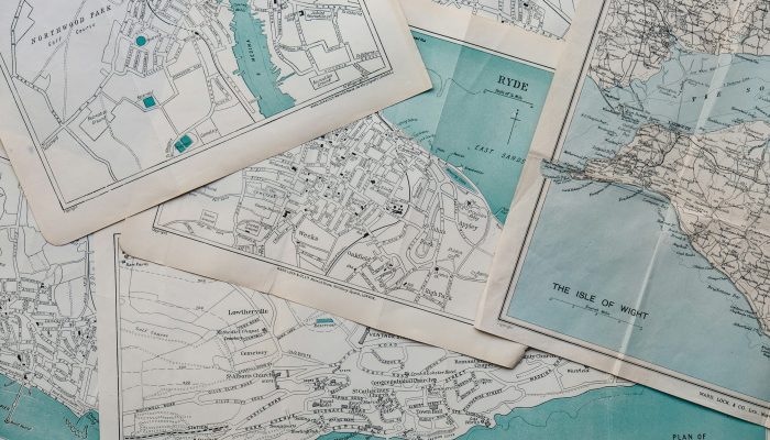
For decades, maps have served as powerful tools for communicating geographic information. This significance extends beyond geographic use; maps have long carried societal connotations of authority and have a rich history of being employed as rhetorical devices.
Yet despite socially constructed connotations of authority, maps unfortunately embody – and will always embody – knowledge that is often manipulated for political, colonial, military or economic ends. Maps can be co-opted as instruments to spread misinformation and contribute to information pollution; this reality has become more apparent in recent years. This is because maps are not neutral depictions of space; they constitute politics of knowledge and relations of power. Research demonstrates that the human brain is more inclined to believe visual information, which makes maps a dangerous vessel for spreading misinformation.1
In response to this challenge, this article offers three lessons for integrating best practices into spatial information literacy programs to combat the misuse of maps in the spread of misinformation.
Lesson 1: Maps are a way of conveying and structuring the human world that is heavily dependent on the biased sets of social relations.
A brief exploration into the history of mapping reveals the profound extent to which political, religious or social power shapes the context of cartography. Maps have not only depicted the geography of land, but also reflected the interests and biases of those in power. By understanding this context, we can recognize how maps today can be wielded as powerful tools for manipulation by those in positions of authority.
A recent example underscores the potential of maps to distort reality for political purposes. In 2019, then-U.S. President Donald Trump tweeted a map that appeared to show the country filled coast-to-coast with Republican electoral districts accompanied by the words ‘”try to impeach this”. The map, however, did not accurately represent population density and voting results, resulting in a misrepresentation of scale. Figure 1 below displays an example of how different the map looks if it represented where people live and where they voted more granularly.
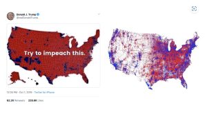
Figure 1. The choropleth map tweeted by Donald Trump (left) and the map accounting for population (right) by Kenneth Field. Screenshot by author.
This example demonstrates the need to scrutinize not just the content of maps but also their underlying intentions and the potential distortions they may present. By acknowledging the historical and political contexts that influence cartography, we can better understand how maps can be used to manipulate perceptions.
Lesson 2: We will always have better or worse maps, but never true. Maps in and of themselves are not value-free imagery. This means that while maps can provide valuable insights, they are inherently subjective and cannot be considered absolutely true or false.
A notable example of this principle is a controversy from 2008 involving a map created by U.S. government employee Ian Thomas.2 Thomas produced a map highlighting caribou calving sites in Alaska, which his superiors deemed unscientific and unusable. He was dismissed from his role after this backlash because the map he created contradicted his political superiors’ interests and their own map that showed oil rich areas in the same Alaskan landscapes.
Despite the government’s criticism, both Thomas’s caribou map and the officials’ oil map are valid representations of different data sets. Both provide perspectives based on the chosen focus, whether it’s environmental or economic. This example underscores that maps are not absolute truths but rather tools that reflect a political viewpoint and priority.
Lesson 3: We must reject cartographic mystique and become cautious consumers of maps! From a young age, we are taught to be cautious consumers of information. However, our education often falls short when it comes to becoming cartographically literate. Maps are often perceived as authoritative and are often assigned undue credibility.
In order to dispel this cartographic mystique we must adopt a critical mindset. When engaging with maps, consider the following questions:
- Have you examined the title, description, legend, scale, source and any other labels? Who made the map? Why do you think they made it? What kind of data is being represented? Where did this data come from? Is it reliable?
- When we actively question and analyze these aspects, we can dispel the illusion of maps as infallible sources of truth and foster a more critical and informed approach to spatial information.
In conclusion, maps are powerful tools that reflect more than just geographic data—they embody the biases and intentions of their creators. By becoming aware of the historical and political influences on cartography, recognizing the subjective nature of maps, and approaching them with a critical eye, we can better navigate the complexities of spatial information in the age of misinformation. Embracing these practices will lead to a more informed and responsible engagement with maps and data, which shapes our understanding of the world.
Footnotes
- McCoy, E. (2017, May 12). Visual Communication is Transforming Marketing – are you up to speed? Forbes. Retrieved from https://www.forbes.com/sites/forbescommunicationscouncil/2017/05/12/visual-communication-is-transforming-marketing-are-you-up-to-speed/#23cbe01a6f7c
- Dunlop, N. (2008). Cartographic Conspiracies: Maps, Misinformation, and Exploitation in Peter Carey’s “American Dreams.” Antipodes (Brooklyn, New York, N.Y.), 22(1), 33–39.
Works Cited
Harley, J. B. (1996). Maps, Knowledge, and Power: Excerpts from: D. Cosgrove and S. Daniels (eds), The Iconography of Landscape. Cambridge: Cambridge University Press (1988). In Exploring Human Geography (1st ed., pp. 378–394). Routledge. https://doi.org/10.4324/9781315832555-24
Hodgin, E., & Kahne, J. (2018). Misinformation in the Information Age: What Teachers Can Do to Support Students. Social Education, 82(4), 211-.
Iyengar, S., & Massey, D. S. (2019). Scientific communication in a post-truth society. Proceedings of the National Academy of Sciences – PNAS, 116(16), 7656–7661. https://doi.org/10.1073/pnas.1805868115
Monmonier, M. S. (2018). How to lie with maps (Third edition.). The University of Chicago Press.
Prestby, T. J. (2023). Trust in maps: what we know and what we need to know. Cartography and Geographic Information Science, 1–18. https://doi.org/10.1080/15230406.2023.2281306
Nicole Slattery is a liaison librarian at the University of Toronto Scarborough. You can contact Nicole at nicole.slattery@utoronto.ca.
Related Posts